5 Best Blog Design Trends For 2018

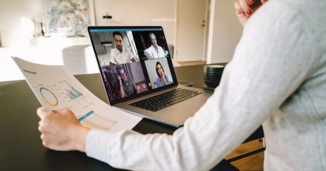
TechsPlace | Blog design is halfway between form and functionality. It is therefore logical that new trends are largely influenced by technology, be it devices, operating systems, browsers or program libraries available on the market. But the recent aspirations of today’s graphic designers go even further, they also influence the very principles and philosophies of design.
Together, these technological advances have created a real turning point in the history of web design, particularly with the emergence of adaptive sites (“responsive” in English) and more generally, mobile oriented designs. Without further ado, here are the 5 trends that we believe will wreak havoc this year:
- Menus that defy any navigation paradigm
Since the archaic birth of web design (that is to say, 20 years ago), we have seen two types of navigation: top (menu bar at the top) and sidebar (menu bar at the sides). It was the arrival of responsive design that led to the arrival of the hamburger menu.
With all this mix of good and bad feelings and the ever-growing development of mobile navigation, we can expect to see something new on the menu side this year. Here are some examples of the burger trend:
- Create a frame with its menu.
- Simply delete the
- Adopt the hamburger button and forget everything else
- Pop-up menus
- Separate Screens
Or, divide the screen clearly into two equal parts. This is something we expect to see more and more in 2018. Very visual, this trend is reminiscent of traditional books and gives a very natural side to the design. It is also a very flexible trend: you can imagine two blocks side by side in desktop version and one on the other in mobile version.
- Vintage Colors
In recent years, the web has been dominated by gray: light gray wallpaper instead of white, text in dark gray instead of black and, in Material design, slight gray shadows to give depth to objects. After this time of absence, the color is finally back in 2017! And what’s more, it comes back strong of lively and bright vintage tones.
It is not always easy to choose the colors of your website and this choice can be influenced by many things, including the existing colors of your brand, the market in which you operate, the psychology of colors and your personal taste. Whichever color you prefer, think of filters offered by Instagram to create a vintage effect.
- Custom Scrolling
More and more sites are abandoning the traditional scrollbar and opt for a personalized experience. For example, we see emerge the “virtual scrolling”, which allows users to scroll through the content inside the application and not with the browser. This allows you to set up different types of scrolling, as can be seen on the site of Build in Amsterdam where the content scrolls horizontally while being controlled by a classic mouse that works from top to bottom. The transition to the mobile phone is only more obvious.
- Mix Digital Touch
Few years ago, flat design gave way to material design. We then see the return of shadows and color gradients on icons always “flat”, which had the effect of creating the illusion of a three-dimensional space while remaining on a screen yet flat. This year, we are returning a little closer to “realism”. That said, we will not come back to skeuomorphism (which represents the real object digitally). In 2018, the flagship concept is to mix the physical, the concrete, and the tactile to the digital world.
This article is contributed by guest author on techsplace.com.