Creating Great Responsive Design: Best Tips and Tricks
TechsPlace | Wondering how to attract and engage new users? You may start by developing a great website or a mobile app. More and more users tend to surf websites using their smartphones or tablets. That’s why building an app may seem an investment worth making.
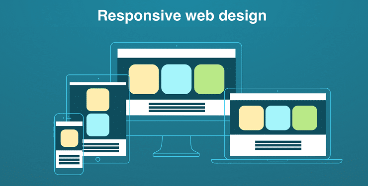
Still, if you’re not interested in creating a mobile app or lack the required budget, there’s another way. Websites with responsive design make content good-looking on all devices – from PC to tablets and mobile devices.
In our article, we’re explaining when responsive design is a good idea, and how to develop it properly. So let’s get started.
Responsive Website vs Mobile App
First of all, mind that even if your website has a responsive design app is still required in some cases. So prior to getting right to the development process, it’s better to compare these two options.
When a mobile app works better?
If you’re going to provide specific services or constantly remind users about your product – application is the best way to do that. After all, it’s much faster to launch an app than surf for a website. And the app’s icon on someone’s screen is a good reminder.
Users may also want to check some details while there’s no Internet connection. It can be their profile, order history, etc. Websites don’t show any details when there’s no Internet connection, so apps is the only option.
Mind that there’s no need to create an app and responsive website in case they serve the same purpose. For instance, your website may be used to describe the product. However, if customers would like to use a service, you provide, they need to download the app.
Finally, if your product requires native functionality of a mobile device (like GPS, camera, contact list), you need a mobile app, not responsive design.
When do you need a responsive design?
If you only start developing your product and people aren’t aware of its benefits yet, there’s no need to spend a lion’s share of your budget on apps. A website will responsive design is more than enough to start promoting your brand. And then, if your product gets recognized, you can develop the app.
In case your website has specific content like food recipes or news articles, apps won’t provide any new features to your audience. Everything depends on the audience and the end target – users can read articles from their mobiles, no app needed.
Building a Responsive Website: Downfalls to Consider
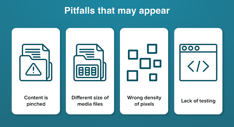
Unfortunately, the development process often meets up with challenges. It may not be easy to skip them, but forewarned is forearmed.
Content
Here developers should look through users’ eyes. They need to figure out what people expect to see and what elements are better to remain hidden. And don’t forget that users will be checking your website from various devices.
Size of media files
When developers work on responsive web design, they should mind the size of images and videos uploaded on the website. Due to the large size of these files, the loading process takes more time, and this issue should be addressed.
Pixels density
It won’t be an issue for experienced developers, but junior devs face it from time to time. Remember that a good website looks perfect on both PC and smartphone screen, and that’s a standard your product should meet.
Testing
A responsive website should be tested on as many devices as possible. Large teams of developers usually have physical devices at hand, and small-sized companies use desktop emulators.
Making Great Responsive Design in 5 Steps
Finally, let’s take a look at the designing process to find out what comes before the actual development and why all the steps are so important.
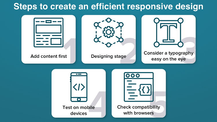
1. Start with the content
Although filling a website up with content is usually mentioned as the last step, it’s not always right. Remember that the content is what users stay on your website for. So it’s the design that should be developed according to future content, not vice versa. Thus, the content should be elaborated first, and only then comes the designing process. You may use the following scheme:
- Copywriters create content for a web designer;
- Designer finds images and logos;
- A designer makes sketches of the website design;
- The sketches are discussed with the development team;
- Designing starts
2. Design
When everything is arranged, designers get down to doing their job – creating a responsive web design. They may use templates from different graphics editors or create the design from scratch – it’s up to you to decide.
3. Fonts matter
During the process, designers should carefully select fonts and take navigation into account. Mind that even the best design won’t work if the fonts look rambling.
Experienced designers use specific tools to develop appropriate fonts. Programs for analyzing typography help to avoid problems in the future and speed the process up.
4. Mind the screen
Designers work on a desktop computer, so they always are aware of how your website looks on a computer screen. But as they are working on a responsive version, it’s necessary to find out how your website looks on a smartphone. Having tested the design on different mobile screens, it’s easy to prevent possible issues like bugs.
5. Check more than two browsers
Sure, it’s great when the website looks good on various devices but don’t forget about checking it in different browsers. They also have an impact on how the website is shown, so make sure to test the website on all popular browsers.
Development stage
If everything works as it should, it’s time to start the development. Front-end developers should have a mockup of your website containing all required images and text. Also, the designer and developers should have a reliable communication channel to contact each other when necessary. All this ensures easy cooperation and thus a first-rate product with an eye-pleasant design.
Wrapping Up
As you can see, the creation of responsive design is a complicated process with quite a few points to take care of. However, if you clearly understand your product’s benefits and objectives, and hire an experienced team, you will get a great product that will definitely find its users.
Vitaly Kuprenko is a technical writer at Cleveroad. It’s a website and application development company in Ukraine. He enjoys telling about technology innovations and digital ways to boost your small businesses.