The Why and How of Mobile-Friendly Web Design
TechsPlace | Do you own a mobile device? You probably have either a smartphone or a tablet that you use to or from your way to work, or when you’re going around the city. How many hours a day do you think you use your mobile device? A few hours?
If you answered those questions honestly, you must have realized the importance of mobile devices in our daily lives. There are now hundreds of apps that we use on the go. Even our favorite websites can easily be viewed on our mobile browsers.
What is a mobile-friendly web design?
The terms ‘mobile-friendly’ and ‘responsive’ are often used interchangeably to describe the same concept of web design: the ease with which one can use a website on a mobile device browser.
A mobile-friendly website is designed in such a way that if someone opens it on a phone browser, it will function normally (perhaps even more smoothly) and won’t reduce the functionality or cause the website to “break” entirely.
Why is it important to make your website mobile-friendly?
Now that there are all sorts of mobile devices available on the market and the focus is shifting away from desktop computers and towards more portable gadgets, it is important to work on mobile solutions for your target market; hence, coming up with mobile-friendly web design is not something you could maybe think about – it is now a necessity.
In order to keep your audience happy and satisfied with their experience of their interactions with you or your brand, you need to make sure that they do not go through any problems when they visit your website, regardless of the type of device they use in order to do that. A properly-built website will help gain their trust and make you seem reliable. On top of that, the short loading times will also help capture their attention.
Thus, if you are in the process of hiring a web development services provider for your website, make sure that they keep mobile-friendliness in mind.
How can you make your web app mobile-friendly?
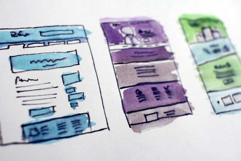
The way that you handle your website’s UI design can help you go a long way. There are several important concepts that need to be dealt with. Let’s talk about five of the most important ones.
Adapt to changing screen sizes
Take a look at this screenshot of what Facebook’s highly optimized mobile website actually looks like in a smartphone browser:

Now, if you have ever tried to force open Facebook’s desktop website on your phone browser, then you must have noticed something being off with the site. This is what it looks like:
As you can see, most of the text is barely visible. You wouldn’t be able to read much without having to pinch and zoom in.
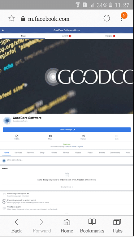
This example shows how important it is to be able to change the layout and design of a website according to the size of the screen on which it is being displayed. You may have to rearrange the content from multiple columns into a single one or change the size of the images and text too.
Develop mobile-friendly navigation systems
Most desktop website navigation bars are horizontally aligned along the top of the website. For the mobile version, however, the navbar would have to be placed vertically since a mobile device’s screen usually operates in portrait mode. The use of the hamburger button is also very common. The button keeps the menu hidden and only displays it on-screen when you tap it. Below is an example of how it works.
Another method of mobile-friendly navigation is to use icons to symbolize menu items. These icons are then arranged in a compact manner along the top or side of the screen. They save a lot of space and make the menu super-accessible by remaining visible at all times.
Use appropriate font sizes, styles, spacing, and colors
Since mobile device screens are much smaller than desktop browser windows, you need to use appropriate font sizes and styles that are visible and easy to read. It is also important to utilize white space effectively so that your content does not clutter the screen, especially when the screen is smaller. Otherwise, the reader will feel overwhelmed or simply won’t look at your webpage twice.
Colour schemes are a very important part of web design too. For example, if you want to catch the viewer’s attention in one particular section of your website, you can use a bright color that pops out from the rest of the colors used throughout the page. This is especially necessary for mobile sites because most users don’t spend a lot of time on the same page. They quickly scroll through a page and if they don’t find anything useful, they move past it onto the next page.
Be smart with incorporating forms
People generally find it a hassle to fill long forms that go on and on and on… scrolling through forms is tiring, especially when they require the user to type out the answer to each question.
If you have a form (such as a contact form or a survey) on your website, you can either make it very concise or divide it over multiple pages. For example, you can put 5 questions on the first page. The user would then tap the next button and go on to the next page, which would contain 5 more questions.
Enable Accelerated Mobile Pages (AMP)
The AMP framework works with the HTML and JavaScript code of your website to build webpages that would load very quickly on mobile browsers. This technology strips down your code and replaces it with a faster, lighter HTML code that contains none of the heavy elements from your original code.
There are other ways of increasing the loading speed of your website too, such as using a CDN, implementing a good caching system, minifying code, and compressing content.
Some final words
Once you have incorporated the above-mentioned mobile-friendly web design practices into your website, you can test it and check whether it passes the mobile-friendly test or not.
One way to do that is to go into the Developer Tools option available on Chrome. From there, you can toggle the view between desktop and mobile device screens. You will be able to see the changes on your website in real-time.
Another option is to enter your website URL into Google’s Mobile-Friendly Test tool. It will assess your website and let you know of any potential problems in the form of a detailed report. If there are no problems, the tool will inform you that your website has passed the test.
Once the website passes, you will be ready to go!
Emily Williamson is a Technical Writer at goodcore.co.uk.It is a bespoke software development company in the UK. We focused on helping entrepreneurs, small, and medium businesses create competitive and winning software. I’m passionate about exploring and writing about technology innovation, mobile apps and software solutions.


